Logos are serious business. Just witness the fallout that ensued when Gap changed its logo mark in 2010: the retailer capitulated in the face of overwhelming criticism and got rid of the new design after just one week. The London 2012 Olympics logo fared slightly better: it avoided the ax but was still compared to a “broken swastika” – and was eloquently described by one young commentator as “rubbish.” As with most things in life, though, the pendulum swings both ways. A good logo can be a hugely powerful marketing tool for a business by enhancing brand visibility and burning its image into the shared public retina. And what’s even more satisfying than a good logo? A good logo with a hidden meaning, of course. Here are ten of the best.
10. Amazon

It’s easy to forget that Amazon started out just selling books. Jeff Bezos founded the company in 1994, operating it as an online bookstore from his garage. Still, as it was online only, Amazon was able to offer a range of titles far greater than those of even its biggest bricks-and-mortar rivals. The company’s enormous stock list saw the tag “Earth’s biggest bookstore” make its way on to several of Amazon’s earliest logos – which also featured a large capital “A” with the outline of a river (see what they did there?) running up its middle. The current logo started to take shape in 1998, with the orange swoosh initially extending under the full length of the text. The version used today emerged in 2000, when the long, downward-curved swoosh was replaced by an arrow running from the letter “A” to the letter “Z,” referencing the fact that these days Amazon sells pretty much everything, across the board. According to the online giant, the arrow’s upwardly-curved shape represents “the ultimate expression of customer satisfaction: a smile.”
9. Baskin-Robbins
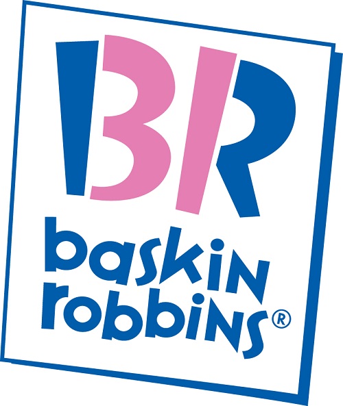
Famous ice cream brand Baskin-Robbins came into existence as we know it today in 1953, when brothers-in-law Burt Baskin and Irv Robbins merged their separate ice cream parlor ventures in southern California. The two men had been in the ice cream-making business since the mid-1940s and between them had already set up a chain of dozens of stores and bought their first dairy, in Burbank. To help establish the Baskin-Robbins name and identity, the company hired ad agency Carson/Roberts (now Ogilvy & Mather), which suggested the idea of offering 31 flavors in order to give consumers the option of a different variety for each day of the month. Nowadays, the 31 flavors concept is still strongly associated with Baskin-Robbins, even though the company now offers a wider choice in store and has brought in over a thousand new flavors since its inception. Even so, what people might not have noticed before is the number “31” cleverly integrated into the current logo, highlighted in pink as sections of the brand’s initials. This logo with subtle messaging was made public in 2007.
8. Carrefour
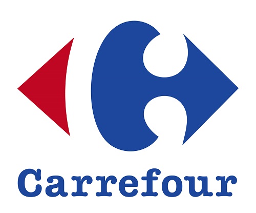
French hypermarket chain Carrefour is a massive player in the retail world, second only to Walmart when it comes to revenue. The earliest Carrefour outlet opened in 1958 in the town of Annecy in southeastern France. This store was located close to a crossroads, and the French word for crossroads is – you guessed it – carrefour. Today, the retail giant has over 10,100 stores situated in 34 countries. Its logo, which was tweaked in 2009, features the blue, white and red found in the French flag, with a white “C” concealed in the negative space between the colors. Although it’s said that only 5 percent of French people distinguish the optical illusion, one possibly even less obvious aspect of the logo is the way in which the red and blue arrows point in opposite directions, a reference to the crossroads from which Carrefour gets its name.
7. Tour de France
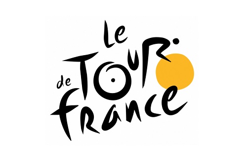
The Tour de France is the most iconic road cycling race in the world and has a rich if highly controversial history. Accusations of substance use have abounded since the very first race took place in 1903, and Lance Armstrong’s 2013 confession to doping – following a USADA investigation which concluded that he was involved with a massive performance-enhancing drug program – is just one of many controversies in the modern era. Nonetheless, the race remains a highlight of the sporting calendar, and its popularity shows no signs of waning. In accordance with the excitement the event generates, its modern logo is a lively affair, and with a little bit of concentration, the observer will notice that the “O,” “U” and “R” form the image of the back part of a bicycle being ridden by a cyclist, while the orange blob to the right – said to signify the sun – appears to be the front bicycle wheel.
6. Toblerone
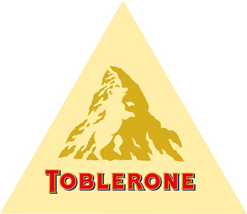
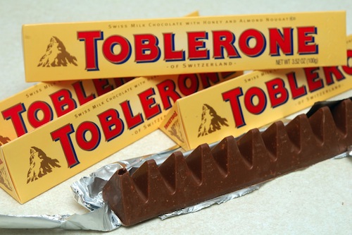
Quite possibly the world’s most famous triangular chocolate, Toblerone was conceived in 1908 by Swiss chocolatier Theodor Tobler in Bern, his country’s capital city. The name “Toblerone” is a combination of Tobler’s own name and the Italian word for a popular nougat candy, torrone. Interestingly, it also contains all the letters, in sequential order, of the city where it was created. The distinctive shape of the chocolate bar is frequently thought to have been influenced by the Matterhorn – a peak lying on the Swiss-Italian border that’s among the very highest in the Alps – although Tobler’s sons have apparently said that this was not the case. Either way, though, the Matterhorn does figure prominently in the Toblerone logo, whose present design hails back to 1999. However, what the observer may not notice at first glance is the bear standing proudly in the center of the mountain graphic. The animal is another reference to the city of Bern, having featured on its coat of arms since the 13th century.
5. Pittsburgh Zoo

Situated in Highland Park in Pittsburgh, Pennsylvania, the Pittsburgh Zoo opened in 1898 and today is one of the few major combined zoo and aquarium facilities in the U.S. Within its 77 acres of land, the zoo houses over 4,000 individual animals and 475 species – with 20 of those species considered endangered or threatened. The zoo is involved with 64 Species Survival Plans, which reflects its focus on conservation. In keeping with its natural focus on fauna, several animals have managed to roam their way onto the zoo’s logo, too. A cursory glance will present the large green tree and two birds leaving their roost at the top of the image; however, a slightly longer look also reveals a gorilla and a snow leopard in the negative white space on either side of the tree – and more subtly, two fish leaping up at the bottom. Moreover, as the zoo itself points out, “Once you have seen them, it’s hard not to see them.”
4. Northwest Airlines

Established in 1926, Northwest Airlines was an important U.S. airline up until its merger with Delta Air Lines in 2008. Northwest Airlines actually started out as an airmail carrier for the U.S. Postal Service, with its first passenger flights taking place in 1927. Fast-forward to 1989, and the logo pictured above was launched, having been designed by global brand consulting firm Landor Associates. Used by Northwest until 2003, this logo features a circle containing a hybrid letter that can be read as either an “N” or a “W.” More interestingly, the triangular upper left segment that completes the “W” can also be interpreted as a needle within a compass pointing – that’s right – northwest. As one blogger said, “Though Northwest Airlines is no more having been merged into Delta Airlines, the logo should be remembered for its deceptive simplicity.”
3. Sony VAIO
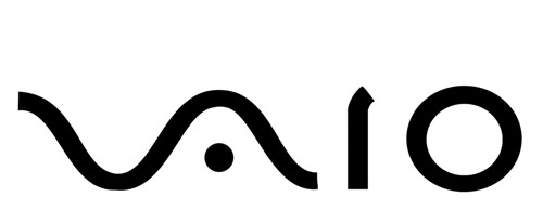
The fairly abstract logo for Sony’s VAIO product line contains a hidden meaning that the observer almost certainly wouldn’t notice unless they were told about it. Japanese electronics and entertainment corporation Sony was established in 1958 by Akio Morita and Masaru Ibuka; and the VAIO sub-brand was introduced in 1998, with the range encompassing a great deal of Sony’s computer products. The name “VAIO” derives from it being an acronym of Video Audio Integrated Operation – although in 2008, to mark ten years of the brand, this was changed to Visual Audio Intelligent Organizer. The logo itself, however, has a less straightforward meaning, having been designed to reflect the brand’s merging of analog and digital technology: the curvilinear “V” and “A” of the logo reference an analog wave, while the “I” and the “O” allude to the 1s and 0s of the binary number system. Who knew?
2. FedEx
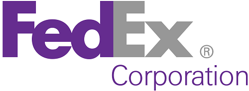
The FedEx logo mark sits firmly in the “simple but effective” camp. It’s been the recipient of more than 40 design awards and in 2003 was recognized as being among the eight finest logos of the last 35 years by Rolling Stone. Another product of Landor Associates, this instantly recognizable mark was conceived in 1994 by senior design director Lindon Leader, who was working out of the branding consultancy’s San Francisco office. Leader and his team approached the project by creating over 200 initial design concepts, which he said ran the gamut “from evolutionary to revolutionary.” But it was only when he began tweaking the letters from two of his favorite bold fonts – and noticed that a white arrow was taking shape between the “E” and the “X” – that the logo we know today really took hold. Those who hadn’t noticed the white arrow before will certainly see it from now on – yet it remains a completely unobtrusive and integrated facet of the design. As Leader says, “Understatement is much more effective, much more elegant.”
1. Facebook Places
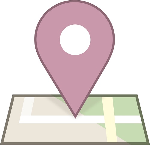
In 2010 Facebook introduced the Places feature that enabled users to “check in” via a mobile device and so allow friends to learn their current location. Other location-oriented mobile sites such as Foursquare had already proved their popularity, and at the time there was speculation that the introduction of Places would sound the death knell for these different check-in utilities. However, rather than engaging in direct competition, Facebook chose to partner with the utilities – including Foursquare – for the launch of Places, thus promoting wide cross-compatibility.
The Places logo featured a pin on a generic section of map, although on closer inspection that same section of map starts to bear an uncanny resemblance to a four inside a square. Despite speculation from some that the move was intentional, Facebook Design Strategy Lead Aaron Sittig confirmed that it was not. “No one [at Facebook] noticed that the roads formed the number 4,” he said. “We sure got a laugh from the news stories, but could only wish we’d been so clever.” Nevertheless, Facebook Places was axed in a little over a year, while Foursquare is still going strong today.


